UX had significant issues that made navigation difficult and frustrating.
Color scheme posed challenges, making it difficult to use and reducing overall usability.
Design felt cluttered and lacked sufficient spacing, leading to a cramped and overwhelming user experience.
Buttons were poorly placed, leading to confusion for users.
UI was outdated, lacking both intuitive functionality and aesthetic appeal.
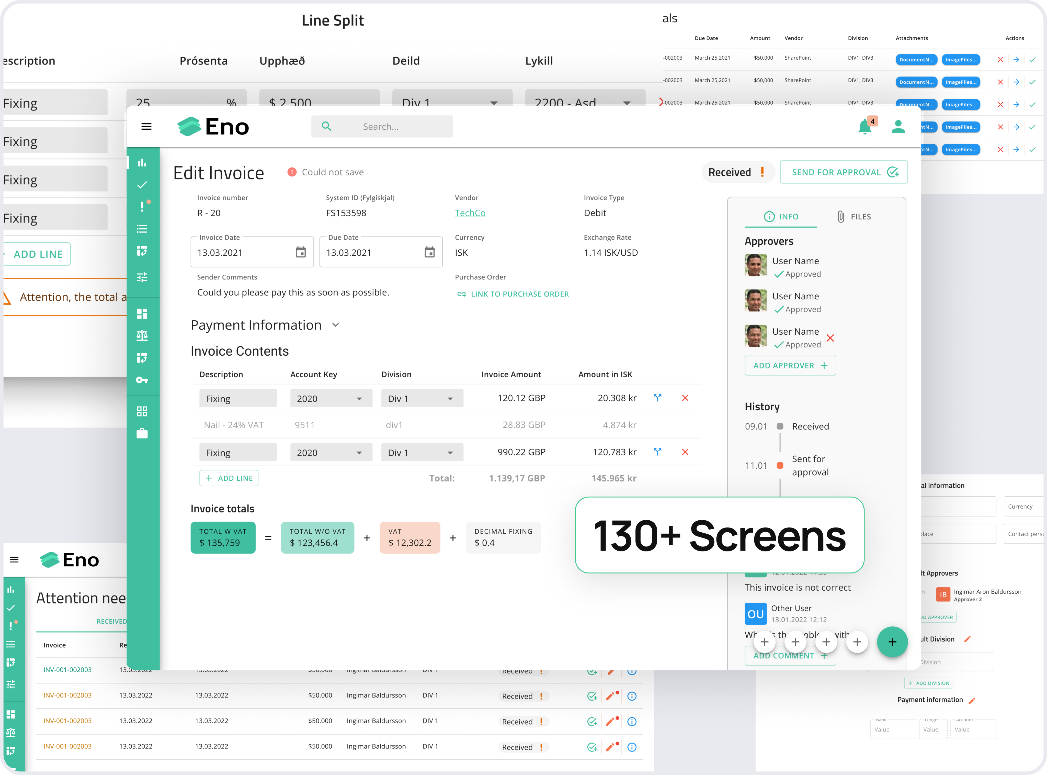
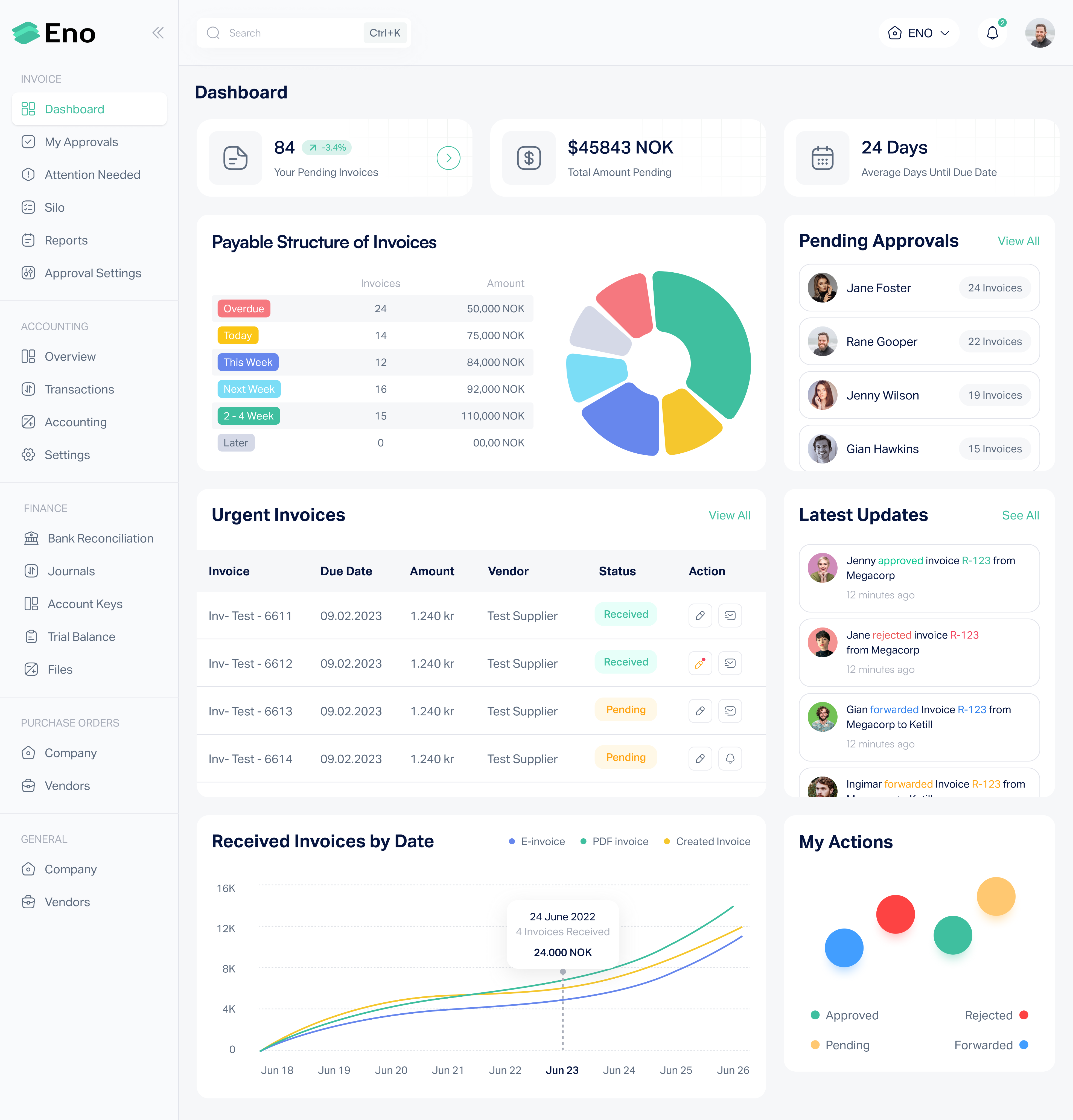
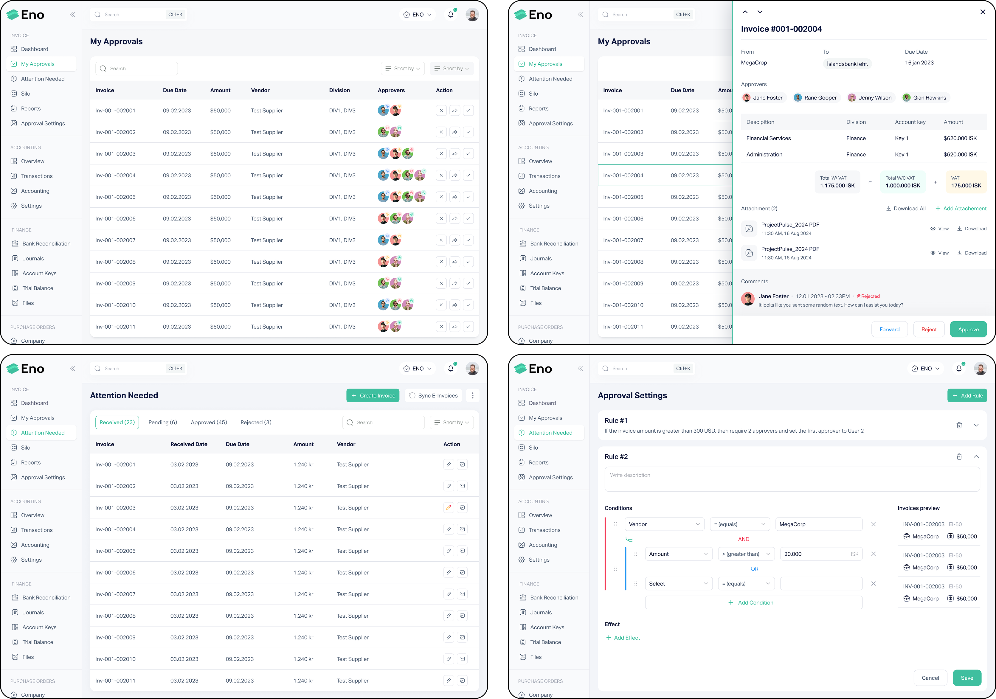
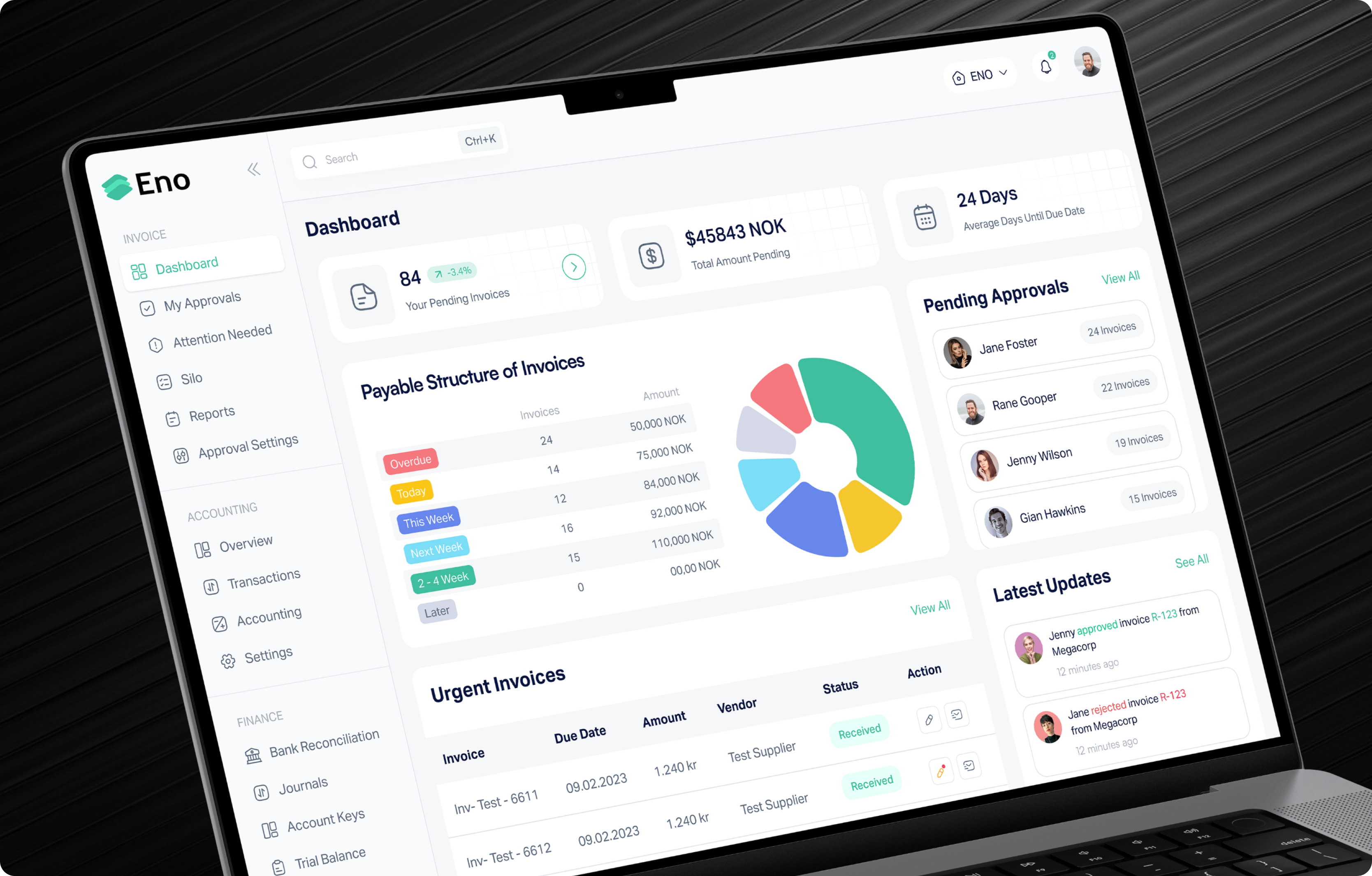
The structure of the 130+ screens was reorganized, streamlining navigation to ensure a more logical and user-friendly flow. Key actions were made easily accessible to reduce user frustration.
A more cohesive and user-friendly color palette was introduced to enhance usability. The new colors not only improved visual clarity but also ensured better accessibility, reducing strain for users.
The cluttered design was cleaned up by increasing spacing between elements, creating a more balanced and breathable layout. This improved readability and reduced cognitive load, making the interface more intuitive.
Buttons were strategically repositioned to align with common user patterns, making actions like commenting more intuitive and accessible, thereby reducing user confusion.
he outdated UI was redesigned with a modern, clean aesthetic that combined both functionality and visual appeal. The new design focused on enhancing usability while maintaining a contemporary, professional look.
Since it's not feasible to showcase all 130+ screens in this case study, here are a few updated screens from the project below as proof of the improvements made.